 12373 Views
  12 min read
When I first heard about using a multi-step form for marketing, my first reaction was, “Why would I want to make site users complete more work to give me their information?”
But you and I already interact with multi-step forms. When you last purchased something online, did the website ask you for your shipping address and billing information on the same page? Or did it break the information you entered into steps?
Multi-step forms may have originated out of necessity on ecommerce and ticket purchasing sites, but savvy marketers have turned these forms into effective lead conversion tools. In one case, the researchers at Formstack found multi-page forms have a conversion rate of 13.9% compared to the single page form’s 4.5% conversion rate.
Conventional marketing wisdom recommends that limiting form fields leads to higher conversion rates. Form conversion rates drop to 15% with 6 or more fields. But sometimes you need to collect more information in order to qualify leads. Breaking up a long form across multiple steps that are initially hidden from the user reduces the mental friction preventing form completion.
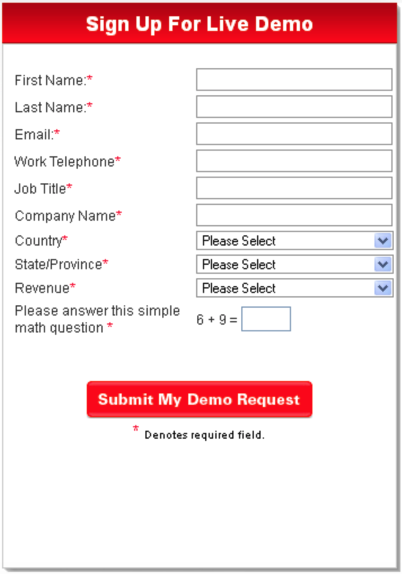
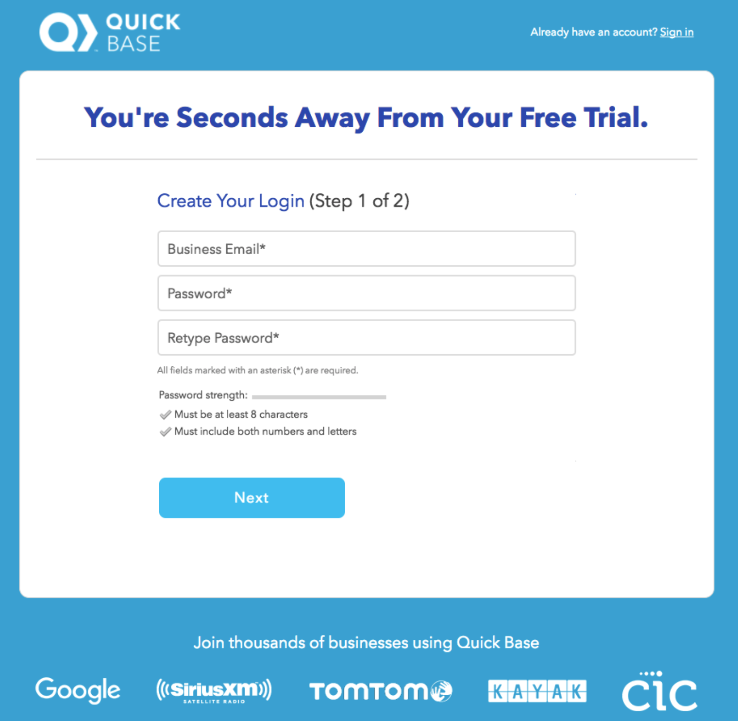
Which one of these forms would you be more likely to fill out?
Multi-step forms allow you to ask the questions you need to further qualify the value of a lead.
But just breaking your 12-field form across a few steps won’t get you the higher conversion you’re seeking. Read on as I review the most important elements to a successful multi-step form.
At the center of any good online form design is an understanding of the actions a potential customer takes on your website. It’s important to understand that most visitors to a site do not want to give away their contact information, even if your product is the exact thing they need to solve their problem.
Which is why you must optimize your forms to remove mental barriers in your prospects’ minds. For example, lead generation increases if the initial 2-3 pieces of info are collected using a tool that requires no specific input from the user. On their blog, the form experts at Convertica have this motto: “The more a user has to think, the lower conversions will be.”
Instead we recommend presenting multiple choice or yes/no questions that a user can click to automatically move them forward in the form before they realize they’re filling out your form.
When set up correctly, multi-step forms benefit from the endowed progress effect–a cognitive bias where people are more likely to want to finish an activity if they feel they have made progress toward it. The following examples show how they make use of this effect in the functionality of their forms:
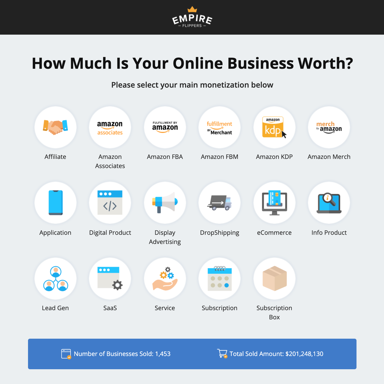
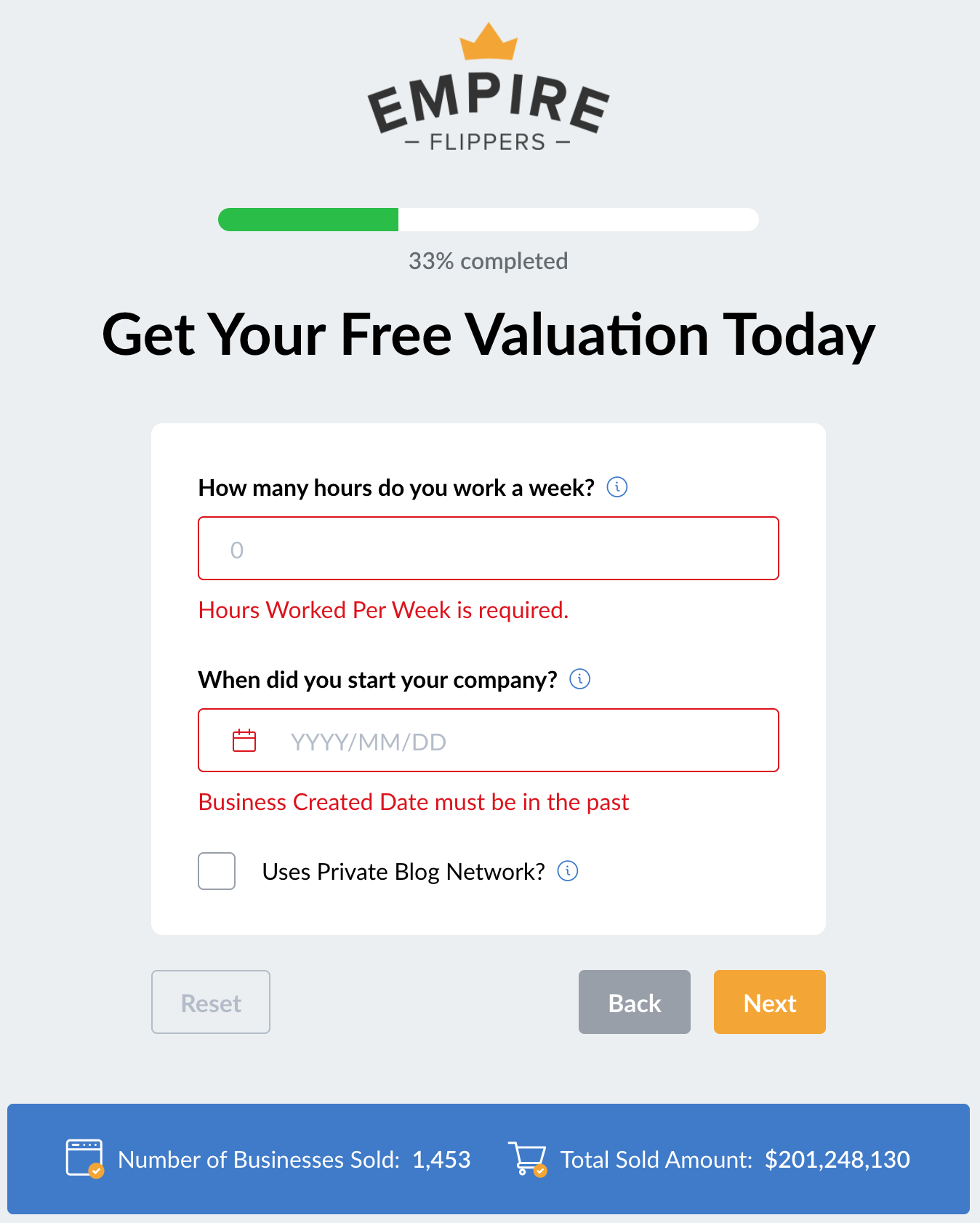
When your entire business model depends on responding to leads who fill out a form, you want to make sure that form makes it easy for them to do so. By optimizing their business valuation form, Empire Flippers saw a 51.6% increase in conversions in just 47 days after optimizing their multi-step form with tools like easy to click buttons and a progress bar.
Take the first step of the form (image 1). The form presents the user with a number of options to identify their monetization. Using these buttons makes it easy for a user to identify their business in a manner more engaging than selecting from a dropdown list. The buttons are easier to read, and the icons help the user skim until they find the appropriate one. Once a user clicks the button, the form automatically moves them forward to the next step, without them needing to click “next.” The progress bar on page 2 shows they’re already a third of the way through, making it easy to keep going.
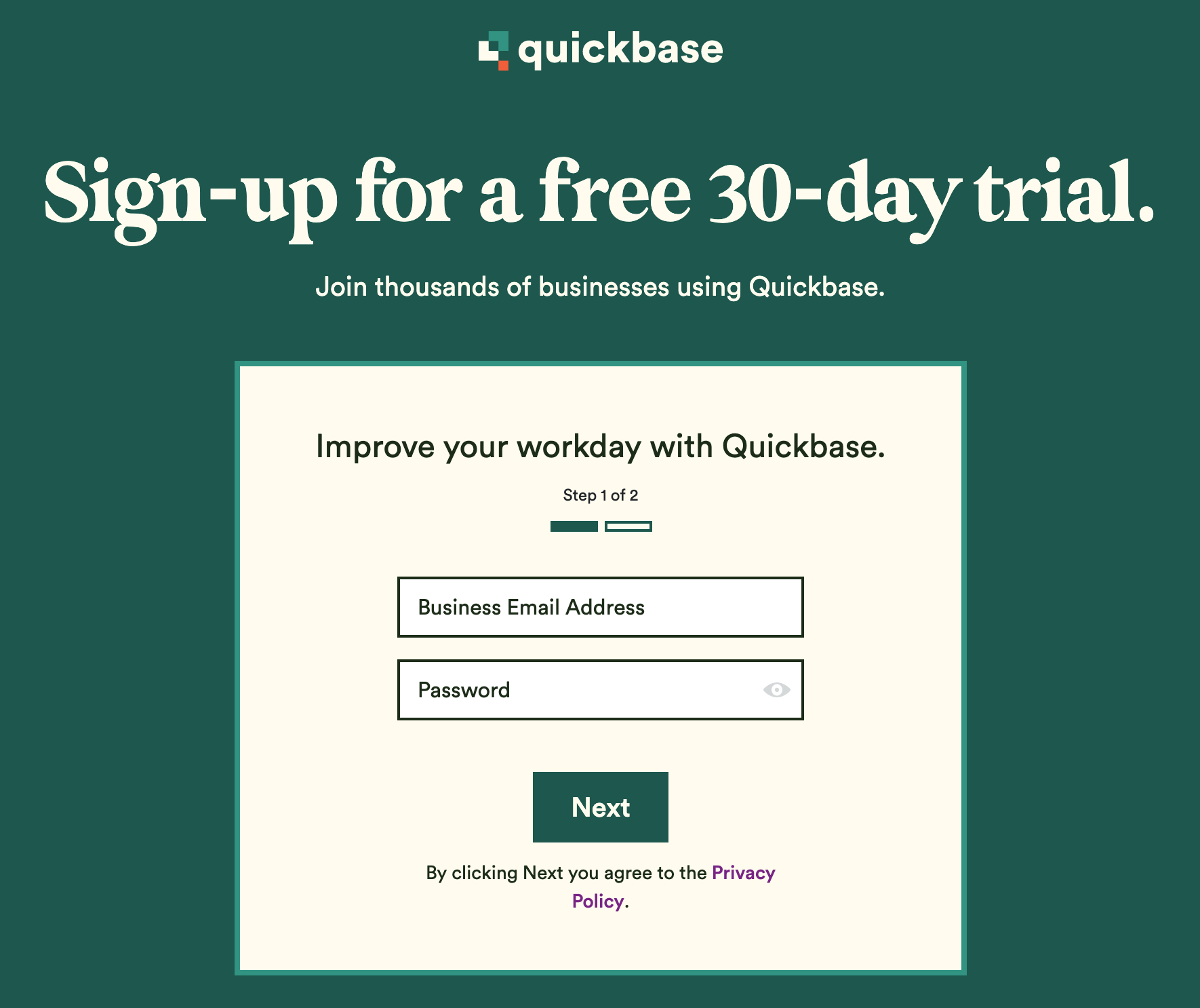
Quickbase is a project-tracking software that asks you to fill out a short form in order to start a trial period. In order to make the sign-up experience as frictionless as possible, they first present you with two short fields to fill out. By presenting the progress bar along with this first step, when you click next and then see seven additional fields, users know it’s the last step. Transparency in the length of the form means less mental friction for prospects.
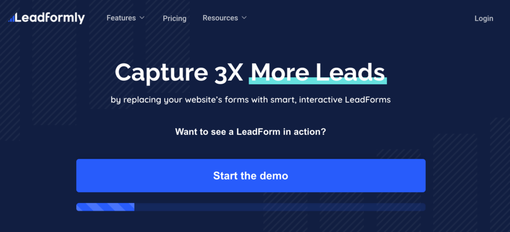
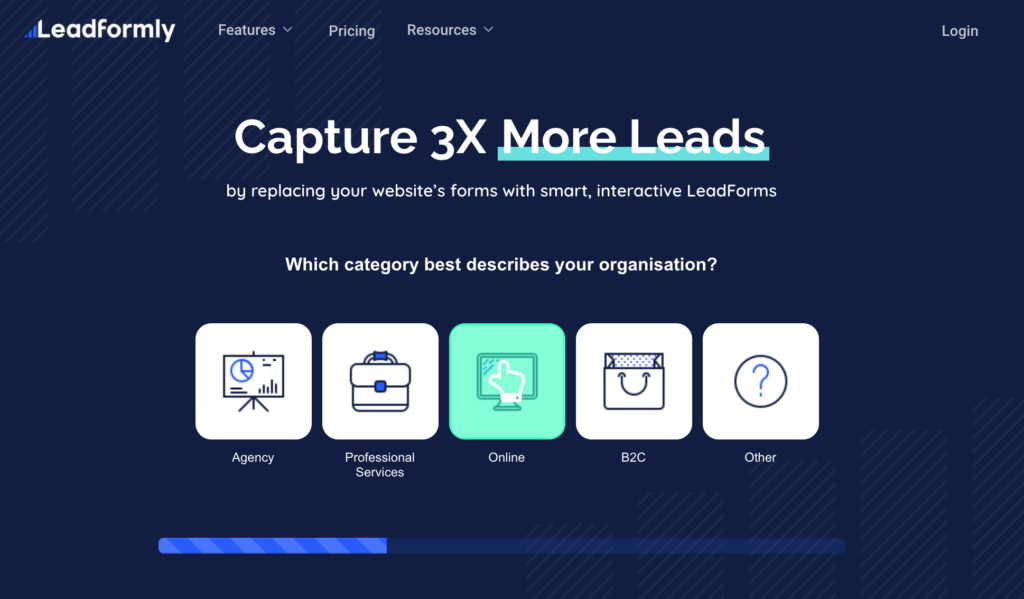
This form is a very good example of a frictionless user interface. One key to improving the conversion of your forms is to minimize visitors’ actions–the fewer decisions a user has to make, the easier it is for them to start down the path to completing your form. In this example from LeadFormly, the first step of the form is just to click “start the demo.” Even before you click the demo, you can see the progress bar in this first step, and the second step is another easy to click button.
By the time the user is asked to input unique information, they’re already halfway through the form. Asking users to submit information by clicking buttons or selecting from a preset list “gamifies” the lead capture process. The idea is you want to make the process flow like the well-designed apps we’re all familiar using, where the first few steps are intuitive and so easy to click through, the prospect doesn’t realize they’ve started filling out a form.
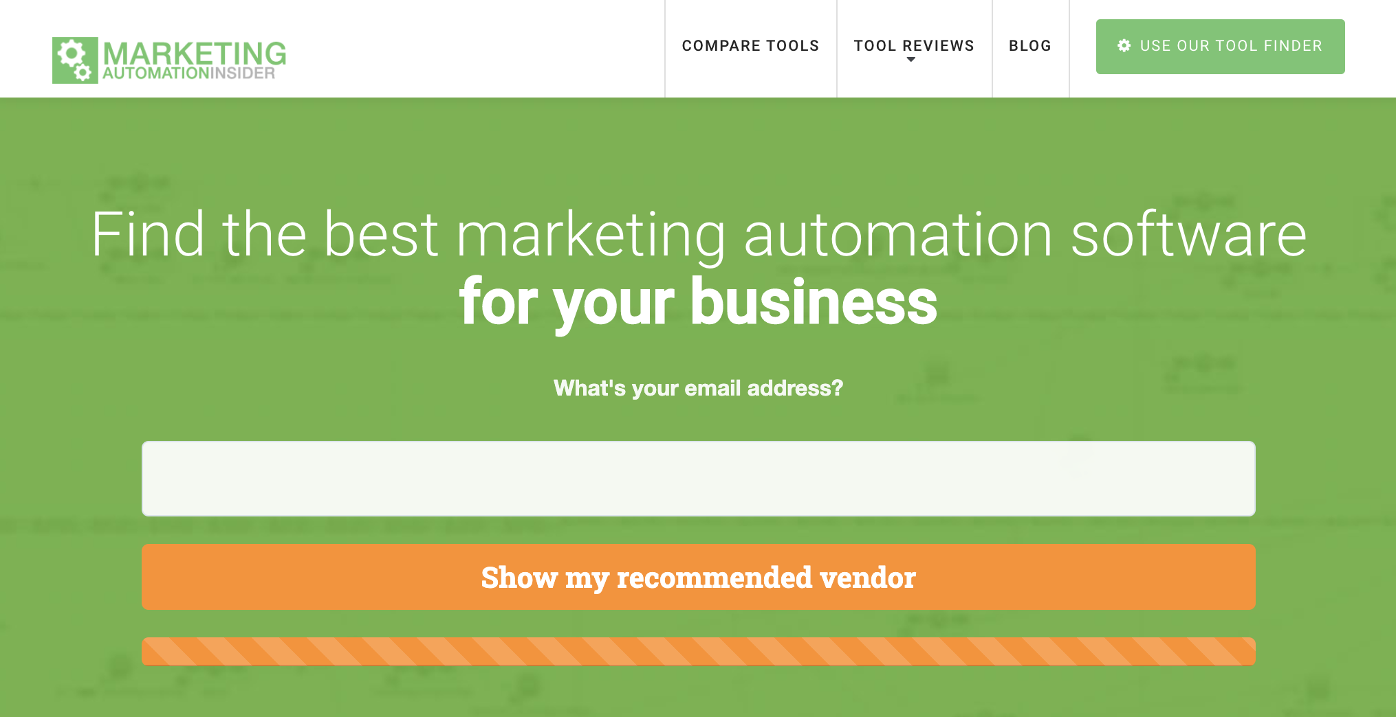
This form too shows the value of the progress bar. This photo is taken from the final step of the form, where all you need is to submit your email. Each step prior to this step had only 1 or 2 fields to fill out, and they save the email submission step for last. We’ll talk about why that’s important below.
Read More: Creating New B2B Customer Sales Opportunities
You may be skeptical about the potential benefits of using a multi-step form on your site. After all, if users don’t submit a one-step form, you can be forgiven for thinking visitors won’t submit a form that’s in multiple steps.
That’s why it’s important to think strategically about what information you want to collect from your visitors. Breaking a form into multiple steps won’t help conversions if you ask for their first name on step one, and their last name on step 3. It also doesn’t help if you take your long form and spread it out among 6 or more steps without any thought to the organization of your questions.
Conversions improved 52.9% when a single-page form was converted to a streamlined, multi-step form. The keyword here is streamlined. By optimizing your form and asking for strategic data, you reduce mental friction and make it easier for users to get to the end of your form before they realize it.
And a note about phone numbers. When asking for personal information, asking for a phone number reduces form conversion rate by 5%. Don’t ask for a user’s phone number unless it’s absolutely critical. Often, converting a visitor into a lead is the first step in your lead nurturing process. If you can hold off asking for their phone number and instead get their email through the form submission, you can continue to nurture the lead with targeted content, and ask for their phone number at a later date.
If contacting a lead by phone is critical to your sales success, put it at the very end, so your ask benefits from the cognitive bias discussed above.
Here are good examples of streamlined and strategic data requests:
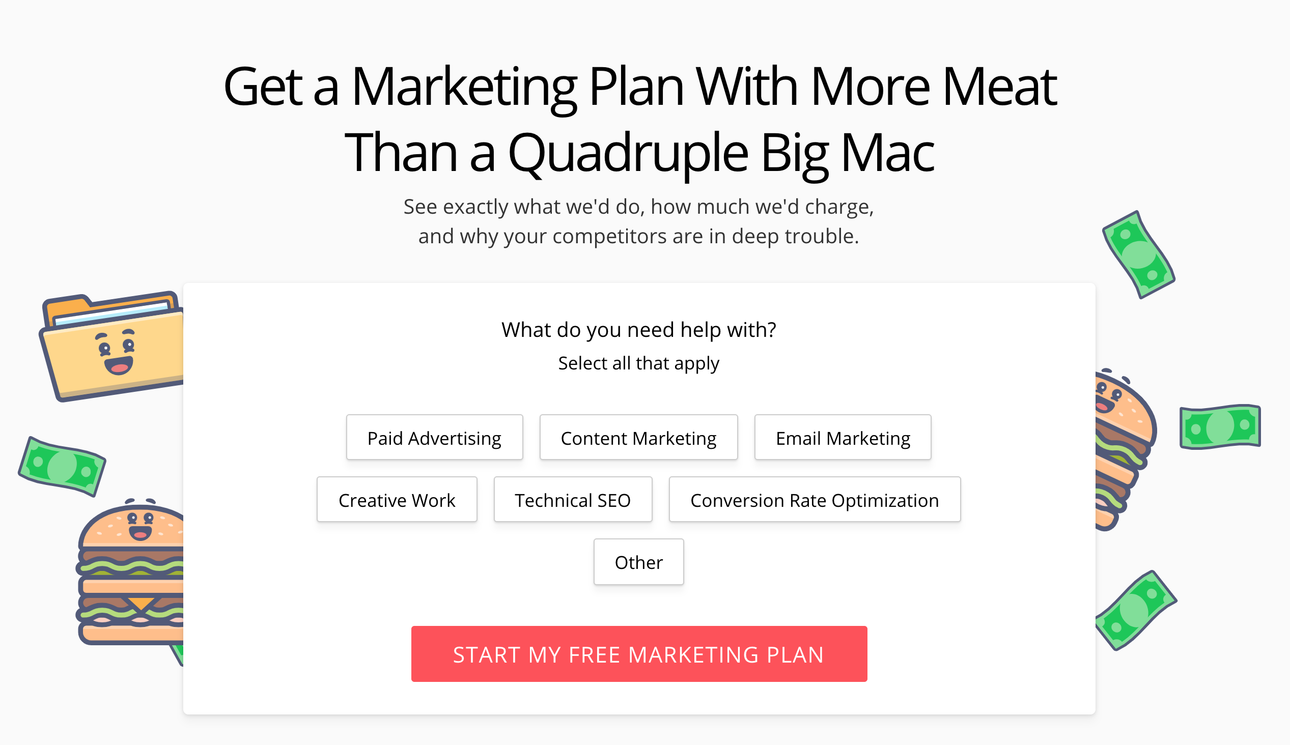
Like other forms discussed above, the user submits information by clicking buttons for the first few steps of this form. This company also asks for the most sensitive information (your email) at the very end of this 5-step form, when it’s most likely that you will submit this info. Through the whole process, the form contains engaging content that reminds the user of what they’re filling out the form for (a marketing plan quote), meaning by the time they get to the email step, each page has reinforced the value of the offer<
Also, the form ensures the company gets some information that benefits them, too, even if the user bails before giving their email, as the step before the email asks for their company website, so the company can still keep track of that visitor.
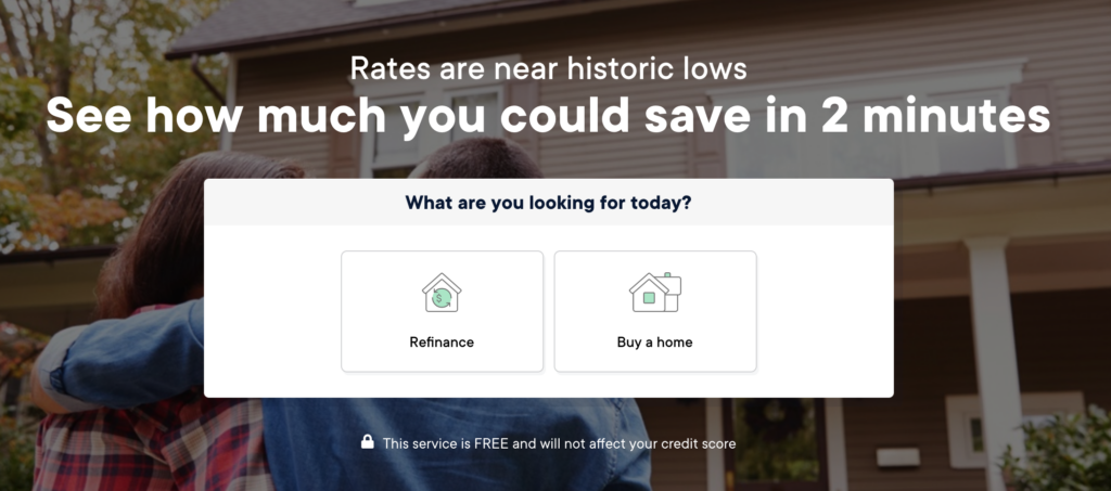
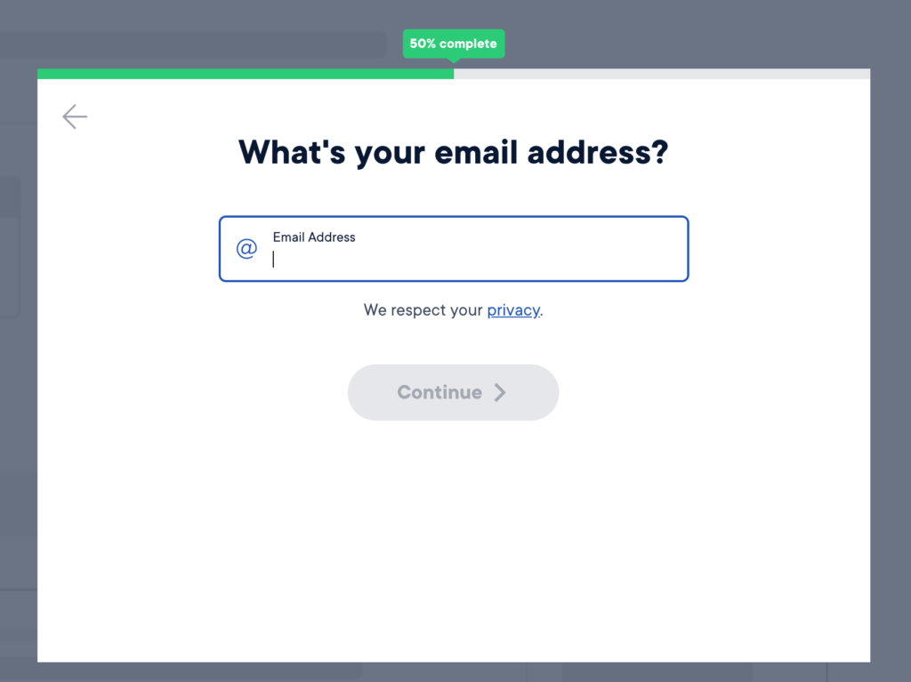
If you’re starting to see a pattern here, it’s because this form too starts by presenting the user buttons to click as the first step. They don’t ask for your email until you are 50% of the way through the form.
A note here, because this form is at the center of Home Loan Analyst’s business, it’s longer than we recommend our clients make their marketing forms (the email step is step 10). This form works because it’s related to home financing, a process users intuitively expect to take a lot of steps to complete. However the first 9 steps before this one are all optimized so that the user is either clicking buttons or selecting from sliders, keeping them engaged in filling out the form.
As the user gets further into the form, the content on each page changes to reflect selections they’ve made on previous steps (for example content addressed to first-time vs repeat home buyers). Adding functionality that shows users content based on their response to a previous step is a small action that further affirms the value the user will get from submitting the form.
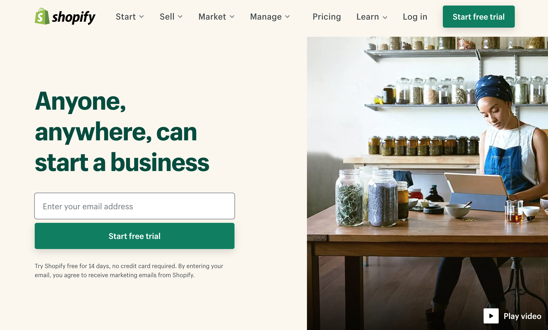
Oops, you caught me. This form example asks for the email first!
The reason I included Shopify’s optimized form is to show that asking for an email first can work, but only if the email is in exchange for a demo or product demonstration, and only when the step after the email ask is short and the final one. If you’re going to ask for the email first, make it step 1 of 2.
Also putting the email ask first works because of Shopify’s business model. They’re selling their platform to small business owners and hobbyists, people who don’t have a lot of time. They know their audience doesn’t want to spend hours reading blogs and customer testimonials when they could be investigating Shopify’s tools themselves. Shopify knows this, hence the email ask is first.
Read More: B2B Lead Generation Tactics
If you’re looking to redesign your lead-generating form, it’s not enough to optimize the form and then leave it at the bottom of your landing page below a wall of text. And if your landing page content isn’t specific to the exact purpose of the form, you can say goodbye to leads.
Businesses report using online forms as their number one method to generate leads. And landing pages have the highest conversion rate among signup forms, at 23%. Spending time to optimize your form only means losing potential conversions. Landing pages serve to further reinforce the value of what you give a prospect in exchange for their email address. Whether it’s a long-form content piece like an eBook or checklist, a demo, or a calculator tool, the better your content, the better your conversions. Here are a few examples of high-converting form landing pages:
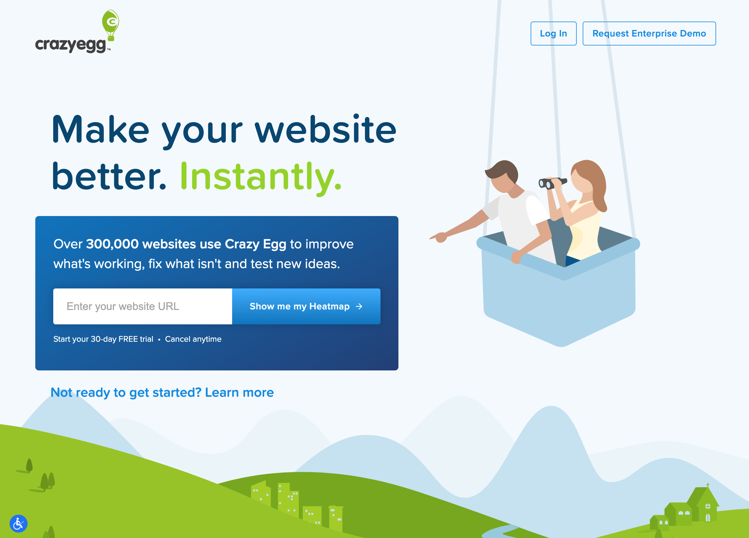
When you put your form on a dedicated landing page, you can also edit the page to minimize distractions. Funnel overload found removing page navigation from a landing page boosts conversion rates by 100%.
Crazy egg has taken this a step further by making their homepage a landing page directed at getting you to enter your URL for a heatmap. When you first land on the page, there’s no navigation bar and you can’t scroll down to see the rest of the homepage. Everything on the page directs you to filling out their heatmap form: the content, the CTA, and even the image (the person in the image is pointing to the form field.
It’s only after reading the page that you see a small line of text below the form that takes you to the rest of their site.
Even if you can’t make your homepage a landing page (and we usually recommend you don’t) this example is a great representation of how to draw attention to a high-converting form.
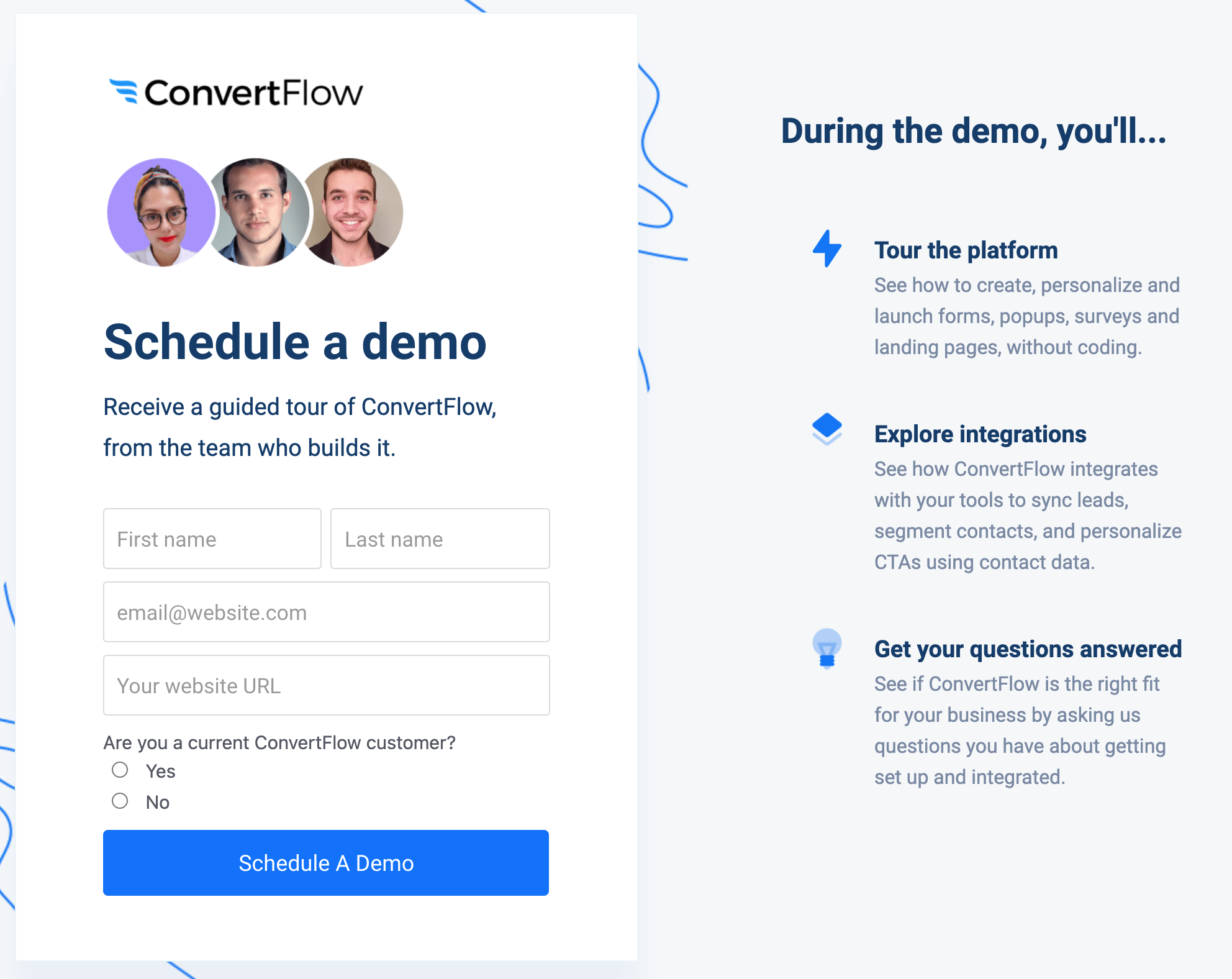
As a more traditional example of a good landing page, ConvertFlow looks like something we’re used to seeing.
The form is a 2-step form, and the image above is the 2nd step in the process to schedule a demo. Important to note here is the form takes you to a unique landing page, with content in the sidebar that reminds you exactly what you’ll get by filling out the form. It’s especially important here because the prospect needs to schedule a demo; there will likely be a short waiting period between when the form is submitted and the demo is scheduled. The text reinforces the value of the offer to keep prospects interested.
On your landing page, it’s good practice to create supporting text that serves as a reinforcement of the value prospects get from completing your form at each step in the process.
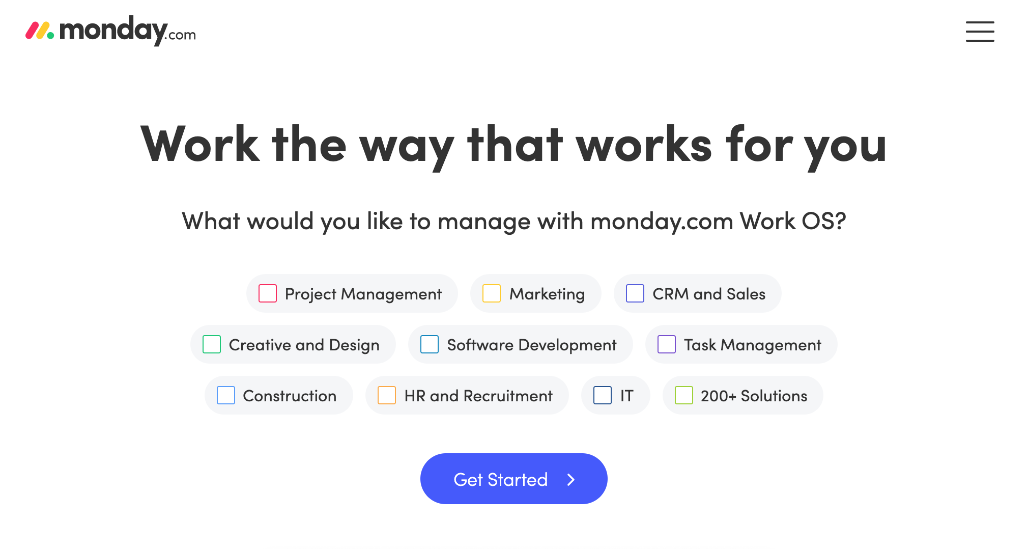
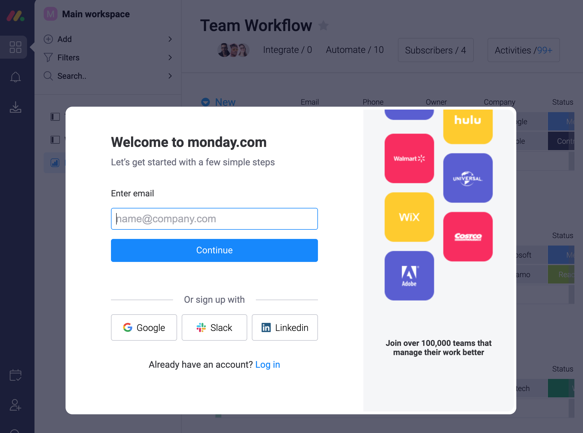
This multi-step form from Monday.com asks you to fill out a few pieces of information with the actual demo you will work with in the background. It works well because you can almost see the demo, setting up the expectation that once you submit the form you’ll be able to work with that exact example. I didn’t notice the first few fields I filled out, because I was curious to know that the actual demo behind the form looked like. Once submitted, the form overlay went away, and I could see exactly what was promised.
The form itself is very engaging, with CTA text on the first step (get started) that lets the user know to expect at least one more step. Each of the CTAs following the first one use text specific to the action the user takes, like “continue” to move them along in the process with little friction.
The content also includes stats that reinforce the value of their product (“Join over 100,000 teams that manage their work better”). We live in a data-driven world, and including stats is another good way to emphasize the value of your product to users.
Are you looking to implement multi-step forms on your website?
Implementing every point discussed above on a single form is not the answer. A lot of the examples are situation-dependent. Factors like your industry, the goal you set for the form, and the ideal prospect you want to attract dictate how you implement your form strategy.
Even so, you don’t have to be an expert to begin implementing multi-step forms. These are the basic best-practices we can extract from the examples above to set you on your path.
When setting up your form, first examine the information that is absolutely critical to your sales process. Be honest, do you really need their street address? Is a text box for their job title necessary when you can ask for their industry instead?
Think about what you need to know about a prospect as you continue to nurture them through your sales process. Focus on the information your sales team prioritizes when first nurturing a lead through the funnel.
Next, organize the information you request from your prospect from least-sensitive to most-sensitive. Strategically, you want each step of your form to funnel the prospect in. Do this by asking for information that they are more willing to part with–for example information about what they’re looking for on your site.
Questions like this are low-stakes; prospects aren’t giving up unique or personal information about themselves. At this point in the process, if you’ve worded your landing page content correctly, a prospect should be excited about the content or demo they’re about to get, and not concerned about how many emails they’ll receive.
The next page should be another low-stakes entry for the user, perhaps a question about their business or profession. This may be a good place to ask for information for your sales team uses to further qualify the lead, something like company industry or the amount of staff they expect to use your product.
It’s important that any information you ask for at every step in the form is directly relevant to the final offer a lead receives for submitting the form. Whether that is a piece of content, an estimate, or demo, only ask information that fits. As an example, don’t ask for their location if the form is just to download a piece of content.
Ask for personal information like email address at the last step of the form.
When building out the form, UX and design are just as important to alleviating mental friction. Those low-stakes questions you ask at the beginning? Make them a button or multiple choice option. The fewer clicks your prospect has to make, the easier it is to move them along. Use a progress bar to further reinforce their progress as they move down the steps.
And finally, don’t be afraid to A/B test. Sometimes the smallest tweak of content on step 3 can be the difference between a frictionless form experience and an exit point for your prospects. Don’t be afraid to test and change what you feel isn’t working.
Are you looking to implement multi-step forms on your site? At Responsify we make it easy for businesses to produce strategic content in a cost effective way. If you’d like to discuss your goals with us and get some specific recommendations, feel free to reach out and schedule a complimentary strategy session here with one of our conversion rate optimization experts. We’re here to help!
