Increasing Clean Tech Customer Conversion with UXD
 Diane France
  873 Views
  5 min read
 Share
Share As a Clean Tech marketer you want your company’s website to be an ambassador of your brand. You probably thought of putting all the necessary content to understand your product and your company’s corporate culture on it. But have you thought of looking at your website through your customer’s eyes? Hard to navigate and outdated websites lose customers. Don’t lose out on leads that share your values and your vision of a cleaner future. Here are some examples of websites that we think are making the most out of User Experience Design (UXD).
Examples of Poor Clean Tech User Experiences:
Across the board we find most CleanTech brands struggle to engage their customers on their website. Here are a few examples that demonstrate missed opportunities for converting customers:
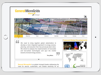
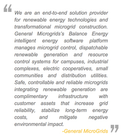
General MicroGrids
- Customers can’t exactly tell what the company does from a quick glance. Did you think this website sell solar panels? Well, it turns out General MicroGrids actually helps establish innovative microgrids. (They are like smaller versions of power grids.) When arriving on a website, users usually quickly scan the screen to know what it’s about. Making it easy for these users to find information they’re looking for is key to converting them into potential customers<
- The description of what the company does is 15 lines long. Don’t drown your customers in an ocean of information. We know it’s feels necessary to explain every nook and cranny on your technology works. But to be precise is to be concise.
|
 |
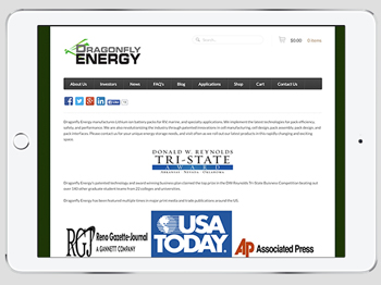
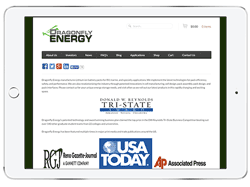
Dragonfly Energy
- The home page focuses on the wrong information. A quick scan leads visitors to focusing on this “DW Reynolds Tri-State Award.” Though this award is a guarantee of the quality of services provided, it does not make clear to the user the service itself. Ultimately the user is unlikely to be won over by this.
- It’s not easy being green…
Clean Tech companies are working to achieve a greener world and green is an obvious design choice. But a bright white or a fresh blue can be much more appealing to customers than a washed out or dark green. |
 |
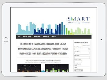
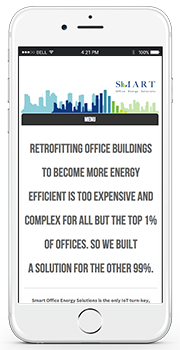
Smart Office Energy Solutions
- It lacks coherence and it is hard to navigate. Having a unified and modern font for your written content is important. The last thing you want is to look outdated. It’s also important to put yourself in the user’s shoes at every step of the way through your website. At this point the user may see two tabs- “solutions” and “products”. These tabs may offer similar explanations which can be confusing to the user. Clear the clutter.
- The website is not compatible with all mobile devices. More than half of internet users access websites through tablets and smartphones. Can you imagine how many potential customers you could lose if your website doesn’t look good on these devices?
|
 |
A few shining examples of CleanTech User Experiences:
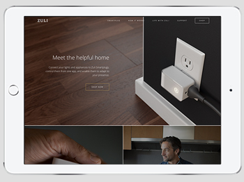
Zuli
- Aligns with the product’s main features.
Zuli’s smartplug is all about making your life more comfortable with a light device that perfectly fits in your home. And what better way to convey this message than with a light white font and high quality pictures of how the smart plug fits into your home.
- Gives the user thorough understanding of how the product works.
When you arrive on the homepage you immediately get a general idea of what the Smartplug is and does. It paints a clear picture and a simple 3-line statement. The toolbar is also replicated in a gallery so that you can find the same information whether you’re scrolling down or up the page.
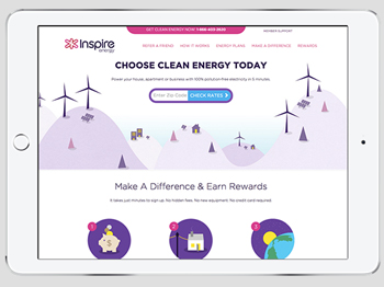
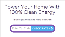
Inspire Energy
- A clear translation of the company’s value proposition. You can feel how the company’s website is designed in order to anticipate the “pains” of customers who want to access clean energy but fear it might be too complicated or expensive. Positioned in plain site at the the top of the home page is the phone number to customer service. Connecting with a representative is the first thing you’re invited to do.
- Call-to-Actions are predominant and easy to find. The invitation to “Check your rates” can be found at every step of the customer’s search for more detailed information. This way whenever the user feels like he knows enough about the product he can quickly access rates to see how much it will cost.
|
 |
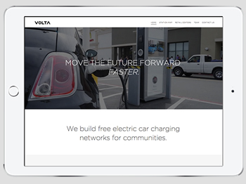
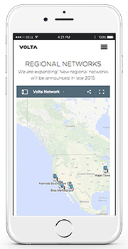
Volta
- It makes intelligent use of animated content. Some websites make poor use of images and videos that hinders the clarity of their content. But Volta masters the use of animated video to explain its technology. When the user scrolls down on the home page, the animated background gives way to a bright white background displaying all the useful information.
- It displays well on mobile devices. An important landing page of this website is the “station map.” The station map lets customers know where they can charge their electric car close to home. This information is great to use on the go so it’s a great that it loads quickly and clearly on mobile devices.
|
 |
Websites that communicate better, use well designed elements, and create an engaging and mobile-friendly experience produce strong relationships with customers. Use these examples of UX Design and increase your customer conversion rate and delight customers!
Also Read – Finding the Right Clean Technology Content Marketing Service
Keep an eye out for an email from us to book a your strategy session.