
 new post
 Diane France
  2481 Views
  3 min read
 Share
Share As a Health Tech company you must have heard of responsive website design. But why is it so important for your website to be responsive? Epocrates carried out a study by 1,063 physicians about their use of mobile devices at work. 86% answered they use smartphones in their professional activities while 53% use tablets at work. And that was only in 2013! Imagine how many customers you might lose today if your website doesn’t display well on every type of screen. Do the images on your website stay aligned when you look at it on a smartphone? Are all the navigation bars optimized so that it is easy to navigate on any device? Does the animated content display well on smaller screens? If not, your website is just part of the overwhelming majority of unresponsive Health Tech websites out there. The good news is we’ve managed to find a few nuggets you should draw inspiration from.
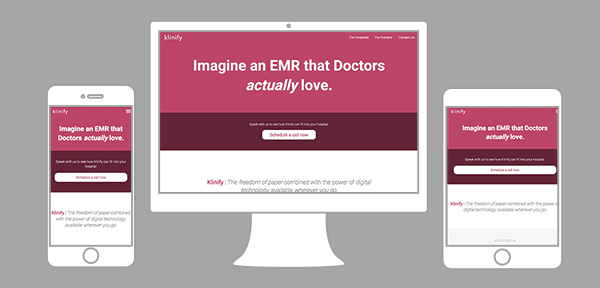 |
http://www.klinify.com/en/ Klinify is a user interface for doctors to centralize patients’ files and information. It’s also designed for doctors to access their patients’ information wherever they are. A good feature of this responsive website is the optimization of the content according to the size of the homepage. Klinify’s designers understand the saying “a picture is worth a thousand words” and have applied it wisely. When you display the website on a smartphone, the pictures on the tablet get more space than the written content in the “doctors” section. A third good point: on a smartphone, the content is balanced so that users don’t have to endlessly scroll all the way down the homepage.
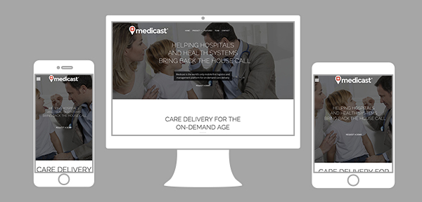 |
https://www.medicast.com/ If you compare the website on a laptop and on a smartphone, you’ll see the homepage image actually moves horizontally. This is another way of optimizing your visual content, making it all the more dynamic. The quality of the pictures also does not worsen with the change of format. So even on a smartphone you can navigate all pages without losing the features that make the content interactive. You may find on many responsive websites that the top navigation bar transforms into a menu toggle icon. This saves a lot of space and does not force you to choose between written content and pictures.
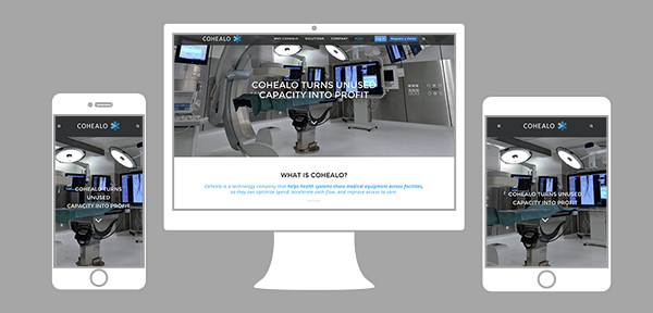 |
http://cohealo.com/ Cohealo sells solutions for care facilities to share medical equipment. This benefits their patients and optimizes their spending. Given the nature of their service, Cohealo targets four categories of customers: care facility executives, finance teams, clinicians and the supply chain management team. Most of these clients do not spend their workdays in front of a computer. So having an easy to navigate mobile website is important for their customers< The content is once again optimized and depending on the size of the home page, it doesn’t get the same treatment. If a user looks at Cohealo’s blog for example, they don’t see the sidebar which displays the list of articles that are available to read. This is not lost content, rather a decision to keep the interface neat. Could your website be part of this list? Let’s hope so! Invest in a little makeover to ensure you don’t lose many potential customers.
 More informative content