 2,084 views
 2127 Views
  2 min read
As a Clean Tech professional, it’s your job to get new customers to adopt a technology. To do that they first have to understand it. That’s where your website comes in. Check out and learn from these three examples of Clean Technology industry responsive websites:
 |
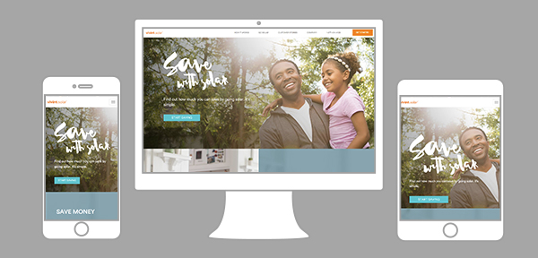
http://www.vivintsolar.com/ Vivint Solar’s differentiting messaging is to guarantee that their customers “Pay less for power”. No matter what size screen their customers might be viewing this website on, their message is always front and center. When you expand or contract the website window the homepage videos and images stay in place. The quality of the whole does not worsen with the change of size. Even on a smartphone a customer can easily navigate the website with all it’s features.
 |
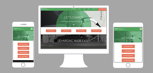
http://www.evercharge.net/ Evercharge’s technology makes it easier for drivers to embrace electric cars. They create simple charging systems that fit well into residential and private parking areas. To market their product, their website clearly makes the case about it’s benefits. The great thing about this website is that the content is unrelated to the size of the homepage. Two examples:
 |
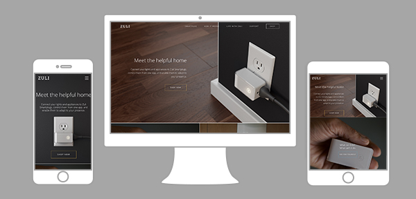
https://zuli.io/ Zuli’s website presents the “Smartplug”. A little device designed to be beautiful, adaptable in people’s homes, and energy efficient. It’s hard to show off such a great product with pictures that lose quality at different screen sizes. Zuli’s web designers made some wise decisions on their website’s smaller screen views. They chose a vertical layout and replaced animated elements with static pictures. This keeps the website neat, fast, and easy to view on smaller devices. Another smart feature is how top navigation bar transforms into a menu toggle icon. This saves a lot of space and does not force you to choose between written content and pictures. Could your website be part of this list? Is it time for a little makeover to ensure you don’t lose sight of the many new customers looking to connect? Step into reality and help them visualize your website on their smartphone or tablet.
Also Read – Finding the Right Clean Technology Content Marketing Service
