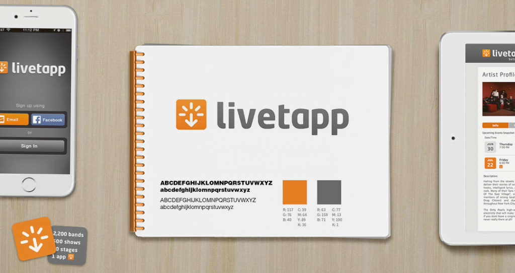
The visionaries at Livetapp helped music fans experience more of the live events they love and earn rewards. They needed a simple yet strong brand identity to represent their edgy and useful service.
That’s where we came in. For places that users would need to find and check-in at, a quick-to-recognize symbol was required. We started by crafting the symbol to demonstrate the action of “tapping” with the excitement of a live event. We took cues from traffic signs to make a stronger impression and allow the symbol to work at all sizes. We then explored typefaces that conveyed the edgy and hip technology personality of the brand. The colors we chose were grey background and orange for highlights. They allowed the identity to work across all it’s applications that were used primarily at night, and stand out when needed.


