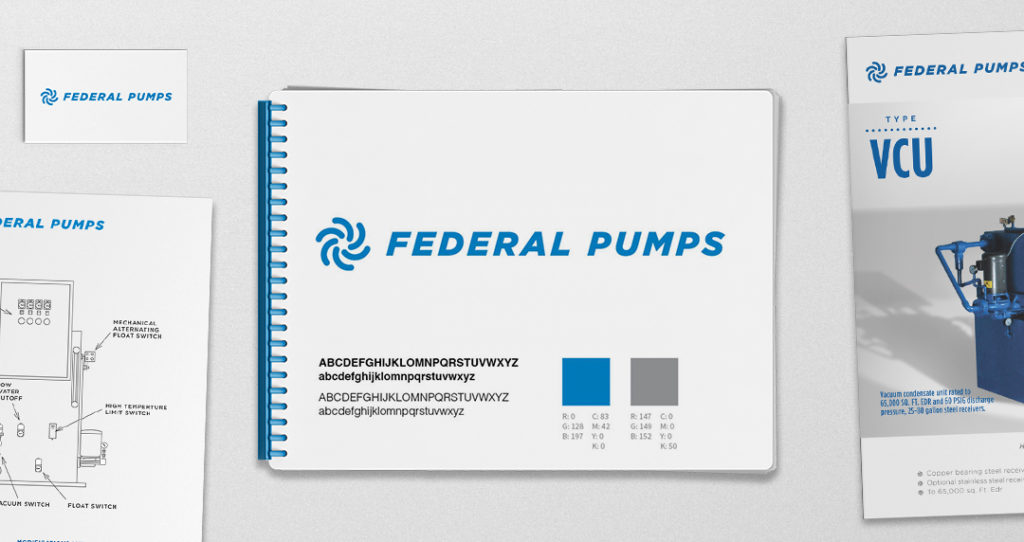


Federal Pumps is one of America’s oldest industrial water and sewage pump companies. They were established in 1927 and are still in full operation today. The challenge was to create an identity that symbolizes the companies history as well as the pumps they manufacture, while preserving their iconic “F” from their prior logo identity design.
That’s where we came in. Based on the existing logo, we started by finding the perfect typeface to represent their brand. We chose one that references early 20th century New York City, when the company was established. We used letterforms that were bold to make a stronger impression and work at all sizes, and italic to reference the motion of their pumps. Then we envisioned visual ways of incorporating the idea of turbine movement into the logo design. We came up with a solution that references their history and symbolizes their products, in a visual way that’s easy to understand (in any language) and memorable.