
 19,136 views
 Responsify
  12922 Views
  4 min read
 Share
Share The golden ratio has occasionally been used in the design of architecture, sculpture, and fine art for centuries. I recently redesigned our logo, and in this post I will cover the history of the mathematical golden ratio, and show how I used its guiding principles when implementing our golden ratio logo design to make it more distinct and quickly recognizable.
According to the Geometry Center, throughout human history, the ratio for the length to the width of rectangles of 1.61803 39887 49894 84820 has been considered the most pleasing to the human eye. This mathematical ratio was named “The Golden Ratio” by ancient Greeks. In the world of math, the numeric value is called “phi”, named for the Greek sculptor Phidias. 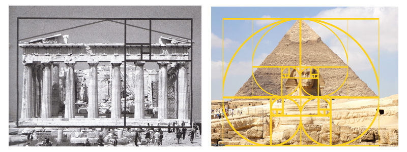 Above are a few examples of the golden ratio used in historic architecture. On the left is the Parthenon and on the right, The Pyramid of Khafre with the Great Sphinx showing the golden ratio. It should be mentioned that there is no direct evidence that the golden ratio was used as a guide for the design of these, however many scholars debate whether it was used. The professional design community at large, believes there is a mathematical harmony to the golden ratio and captures the simplicity of structural relationships.
 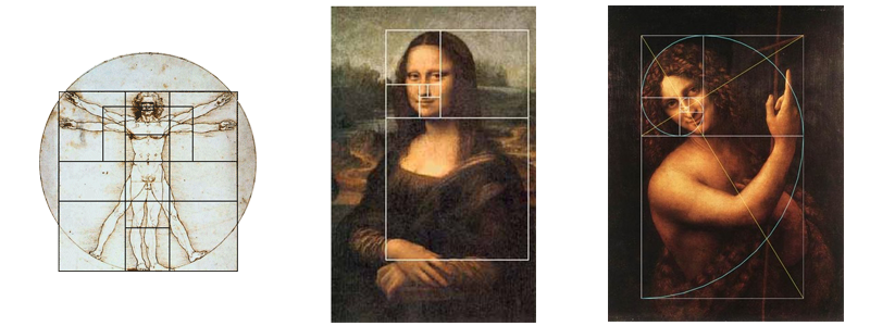 Another example of an artist or designer, who lived after Phidias used this proportional relationship, is Leonardo Da Vinci. He called the golden ratio “De divina proportione“, translated in english as “the divine proportion” and used it as a guide in many of his sketches and paintings.
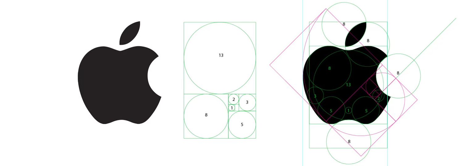 Above is the design of the famous brand Apple Inc. (formerly Apple Computers). This is by far one of my personal favorite marks, as it embodies the deeper meaning of what their brand is about – our imperfections of being human, and striving to being better humans (challenging status quo) – as the apple with a bite taken out of it references the biblical story of Adam and Eve and the original sin. Here you can clearly see how the use of the golden circle distills a complex form into a simple and quickly recognizable mark.
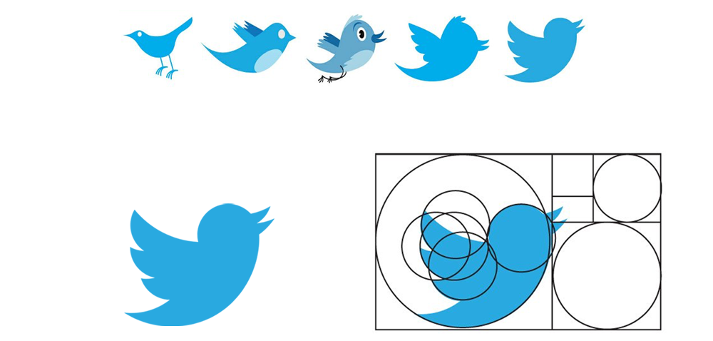 As you can see in the Twitter logo‘s evolution above, the far left shows hand illustrated artwork of the bird with proportions close to that of a real bird, but when viewed as a small icon, becomes degraded and hard to recognize clearly. At the far right, you can see how the bird design had evolved to be a highly simplified icon that is quick to visually read, yet still has personality. This icon, along with Apple’s, mixed with great business strategy, are among the most recognizable icons on earth. I see these icons as being at their simplest and truest form, that can stand the test of time and supersede graphic trends.
![]() All that being said, you now have context as to why I have the highest respect for the golden ratio, in instances when a form can be distilled and simplified for the optimal recognition by its audience. When redesigning our logo, I wanted it to be as equally as iconic and memorable as the Apple and Twitter icons (even though we are a humble and boutique agency). The meaning behind our logo includes two things that embody our brand purpose of “empowering people so they can live a better quality of a life”, the symbol of a butterfly – a metaphor for life transformation – a symbol of empowerment. After going through many iterations of the golden ratio logo design, I challenged myself to use the proportions to design our brand mark. Above is the final result, whereby I used the fixed sized circles following the proportional sizes of the golden ratio to reduce the shape to an easily distinguishable icon, that can be seen clearly up close or far away. I hope you enjoyed my rant on why I respect the golden ratio in art and design, and why I enjoyed using it as a tool to arrive at the final logo for Responsify. Now the logo signifies empowering life transformation more clearly, and will look better on a cape! I hope you have found a new respect for the golden ratio too.
All that being said, you now have context as to why I have the highest respect for the golden ratio, in instances when a form can be distilled and simplified for the optimal recognition by its audience. When redesigning our logo, I wanted it to be as equally as iconic and memorable as the Apple and Twitter icons (even though we are a humble and boutique agency). The meaning behind our logo includes two things that embody our brand purpose of “empowering people so they can live a better quality of a life”, the symbol of a butterfly – a metaphor for life transformation – a symbol of empowerment. After going through many iterations of the golden ratio logo design, I challenged myself to use the proportions to design our brand mark. Above is the final result, whereby I used the fixed sized circles following the proportional sizes of the golden ratio to reduce the shape to an easily distinguishable icon, that can be seen clearly up close or far away. I hope you enjoyed my rant on why I respect the golden ratio in art and design, and why I enjoyed using it as a tool to arrive at the final logo for Responsify. Now the logo signifies empowering life transformation more clearly, and will look better on a cape! I hope you have found a new respect for the golden ratio too.